UI Components
ActionBar
UI component abstracting the Android ActionBar, and the iOS NavigationBar.
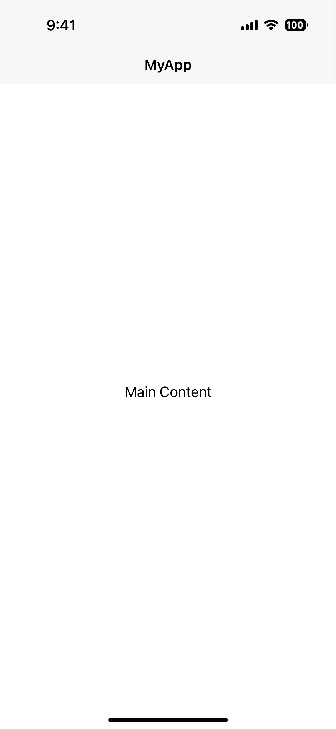
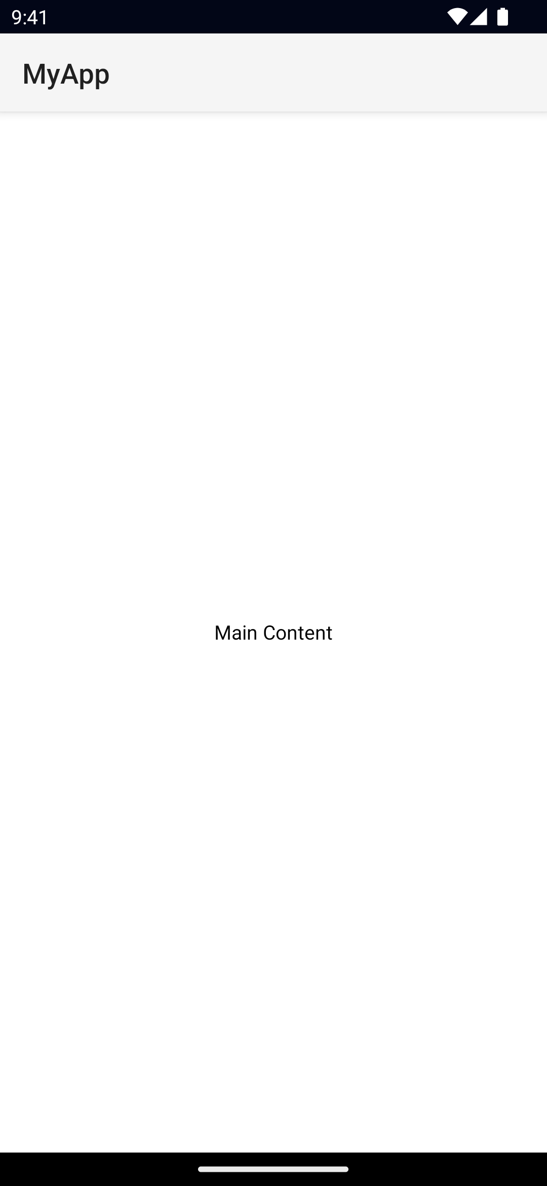
<ActionBar> is NativeScript’s abstraction over the Android ActionBar and iOS NavigationBar. It represents a toolbar at the top of the activity window, and can have a title, application-level navigation, as well as other custom interactive items.
Views also part of the ActionBar abstraction:


Examples
ActionBar with a custom title view
<ActionBar>
  <GridLayout columns="auto, *" width="100%">
    <Image src="~/assets/icon.png" width="40" height="40" />
    <Label text="Custom Title" fontSize="24" />
  </GridLayout>
</ActionBar>
ActionBar with an always visible Android icon
<ActionBar
  title="ActionBar Title"
  android.icon="res://icon"
  android.iconVisibility="always"
/>
Customizing the ActionBar
<ActionBar title="MyApp">
<!-- explicitly hide the back button -->
<NavigationButton visibility="collapsed" />
<!-- show a Font Awesome icon on the left -->
<ActionItem
position="left"
icon="font://"
class="fas"
tap="goBack"
/>
<!-- Show a custom ActionItem on the right -->
<ActionItem ios.position="right">
<GridLayout width="100">
<Button text="Action Item" />
</GridLayout>
</ActionItem>
</ActionBar>Note
On iOS, setting the color only affects the title and the action items.
On Android, color only affects the title. You can set the default color of the ActionItems by setting actionMenuTextColor in App_Resources\Android\values\styles.xml.
Removing the border from the ActionBar
By default, a border is drawn at the bottom of the ActionBar. In addition to the border, on iOS a translucency filter is also applied over the ActionBar. To remove the border and the translucency, set flat="true":
<ActionBar title="MyApp" flat="true" />8.9+
You can alternatively use iosShadow="false" in the event you want to keep the translucency but remove the border.
<ActionBar title="MyApp" iosShadow="false" />Props
title
title: stringGets or sets the ActionBar title.
8.9+
On iOS, you can also enable prefersLargeTitles by setting iosLargeTitle="true"
<ActionBar title="MyApp" iosLargeTitle="true" />titleView
titleView: ViewReplaces the title property with the custom view.
Note: this is the property set when defining a custom child view in xml (Unless an instance of ActionItem, or NavigationButton).
See View.
flat
flat: booleanRemoves the border on Android and the translucency on iOS.
Defaults to false.
navigationButton
navigationButton: NavigationButtonGets or sets the navigation button (back button).
See NavigationButton.
actionItems
actionItems: ActionItemsGets or sets the ActionItems.
See ActionItem.
iosIconRenderingMode
actionBar.iosIconRenderingModeGets or set the UIImage.RenderingMode of the ActionBar icons in iOS.
Available values:
automaticalwaysTemplatealwaysOriginal
Defaults to alwaysOriginal.
ActionItem
<ActionItem> is a UI component for adding action buttons to the ActionBar.
<ActionBar title="MyApp">
  <ActionItem
    ios.systemIcon="9" ios.position="left"
    android.systemIcon="ic_menu_share" android.position="actionBar" />
  <ActionItem
    ios.systemIcon="16" ios.position="right"
    text="delete" android.position="popup" />
</ActionBar>
ActionItem Props
text
text: stringGets or sets the text of the ActionItem.
icon
icon: stringGets or sets the icon of the action item. Supports local images (~/), resources (res://) and fonts icons (font://)
ios.position
ios.position: 'left' | 'right'Sets the position of the ActionItem on iOS. iOS only.
Avaibable values:
left: Puts the item on the left side of the ActionBar.right: Puts the item on the right side of the ActionBar.
Defaults to left.
android.position
android.position: 'actionBar' | 'popup' | 'actionBarIfRoom'Sets the position of the ActionItem on Android. Android only.
Avaibable values:
actionBar: puts the item in the ActionBar. Action item can be rendered both as text or icon.popup: puts the item in the options menu. Items will be rendered as text.actionBarIfRoom: puts the item in the ActionBar if there is room for it. Otherwise, puts it in the options menu.
Defaults to actionBar.
ios.systemIcon
ios.systemIcon: stringSets the icon of the ActionItem using a UIBarButton.SystemIcon. iOS only.
android.systemIcon
android.systemIcon: stringSets the icon of the ActionItem. For a list of system icons, refer to R.drawable. Android only.
See R.drawable.
actionBar
actionBar: ActionBarGets the ActionBar that contains the ActionItem.
NavigationButton
<NavigationButton> is a UI component providing an abstraction for the Android navigation button and the iOS back button.
<ActionBar title="MyApp">
  <NavigationButton text="Go back" android.systemIcon="ic_menu_back" />
</ActionBar>
Platform specific behavior
iOS Specific
On iOS the default text of the NavigationButton is the title of the previous page and the back button is used explicitly for navigation. It navigates to the previous page and does not allow overriding this behavior. If you need to place a custom button on the left side of the <ActionBar> (e.g., to show a Drawer button), you can use an ActionItem with ios.position="left".
Android Specific
On Android, you can't add text inside the NavigationButton. You can use the icon property to set an image (e.g., ~/images/nav-image.png or res:\\ic_nav). You can use android.systemIcon to set one of the system icons available in Android. In this case, there is no default behavior for NavigationButton tap event, instead the passed-in callback will be called.
NavigationButton Props
text
text: stringSets the text of the back button. iOS only.
android.systemIcon
android.systemIcon: stringThe icon to be shown in the button. You can specify any system icon whose name begins with the ic_ prefix. For a complete list of the available icons, see the R.drawable. Android only.
See R.drawable
Native component
ActionBar
- Android: android.widget.Toolbar
- iOS: UINavigationBar
ActionItem
- Android: android.widget.Toolbar
- iOS: UINavigationItem
NavigationButton
- Android: android.widget.Toolbar
- iOS: UINavigationItem
- Previous
- Page
- Next
- ActionItem

